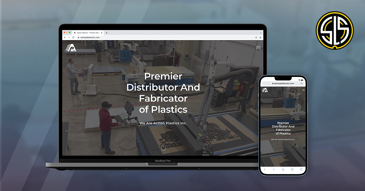
The Next Level for Action Plastics
When we met the father-and-son team that leads Action Plastics, Inc., it was clear the company’s visual presence was underselling its capabilities and success.
Small Team, Big Business
Action Plastics is a premier distributor and fabricator of plastics that provides such services as CNC routing, CNC cutting, custom shims, laser etching, and laser cutting. Taking on exacting projects from engraving awards to creating custom pieces for window installations and beyond, they are able to execute custom orders and innovative one-off pieces at a competitive price point bigger and newer companies just can’t meet.
Why Now?
The Action Plastics team is small but mighty—led by Daniel Jariabka and David Hughbanks, who have more than 30 years of combined experience in the industry. Currently, Action Plastics is entering an exciting new phase in their company’s journey—an internal leadership transition from Dan to Dave—and they want their brand strategy to reflect this future.

A Logo With Movement
First, our team tackled the outdated black-and-white logo, aiming to create a mark that better reflected Action Plastics’ advanced CNC and laser technology, as well as its precision. We combined the “A” and “P” of Action Plastics into a monogram, leveraging the negative space to represent the cutting capabilities of the company. Stacked lines to the left lend a sense of action and a three-dimensional quality that mimics the layers of plastic substrates. A final pop of red adds contrast and a fresh, bold element, while a new tagline—“Precision at the Next Level” —is the finishing touch that brings all these elements together.
Taking Action Online
Action Plastics is equipped with the latest technology, so its website required a modern look and feel. It also needed to set the company apart from competitors—companies that struggle to offer the quick turnarounds and quality custom products Action Plastics can provide.
Plus, Dan and Dave’s previous site left them frustrated and unable to communicate with their customers effectively. They needed reliable functionality and greater ownership over the site.

With a bold red and clean lines, the visual style of the website finally aligns with what they do. As you scroll down, you’ll see a “box-roll,” an eye-catching, in-your-face visual transition. This element, along with various subtle movements across the site, make reference to the mechanical nature of the industry. And finally, the About page better captures Action Plastics’ identity, values, and vision. As Digital Creative Director Brian Fuller said, “Every element of this site comes together to tell the story of what they do and where they’re going.”
In addition to design and development, our team trained Dan and Dave to make website changes and content updates on their own, giving them greater control over their visual presence. And being a tight-knit, local operation ourselves, we’re able to offer individualized support moving forward.
See for Yourself
You can check out the final product at ActionPlasticsInc.com. We’re proud of the hard work and collaboration that went into making this project a success. Good luck to the Action Plastics team!
Are you looking to take your website and visual brand strategy to the next level? Email us today at letstalk@streetlevelstudio.com.
