By Lexie Markarian, Director of Sales
We’ve all been there: the deer-in-headlights moment when you arrive at a tradeshow or conference and have no idea where to begin. Aisle after aisle of booths, nondescript from a distance. Room after room of conference programs, indistinguishable except for the slides on the massive screens.
It’s not an auspicious start, to say the least.
Now, consider a time when you’ve walked into an event space and felt perfectly oriented from the get-go. Colors and textures vibing harmoniously. Signs communicating effortlessly. Traffic flowing smoothly.
Infinitely better, right?
At their best, tradeshow and conference events inspire delight, curiosity, and connection.
For exhibiting brands, they’re a chance to leave an indelible impression—or even to change a prior perception. For event hosts, they’re an opportunity to communicate value to their industry or membership.
Attendees should leave events with much more than plastic bags overstuffed with giveaways and business cards. The best takeaway? A positive and memorable experience of your brand. And while you can’t control everything about attendees’ experiences, you can control your event’s environmental design.
What is environmental design? Fair question. It’s all the ways in which you align your physical presence with your brand promise. It’s everything from color and typography to graphics and textures—the things that make you, you. Environmental design weaves your brand DNA throughout every setting and makes it a distinct part of the experience. And it’s essential for anyone exhibiting at or hosting an event.
Give Them Something to Talk About: Exhibits That Speak for Themselves
Whoever said there’s nothing new under the sun hadn’t been to a tradeshow, the province of all novel things. As you’re planning to reveal the latest and greatest iteration of your products, you can be sure your competition is doing the same. It doesn’t have to be a game of one-upmanship, though. We would argue that distinct and different are better goals than bigger and better.
Your task: create an inviting, brand-aligned oasis in an impersonal and cavernous exhibit hall. Daunting? Yes. Doable? Also yes.

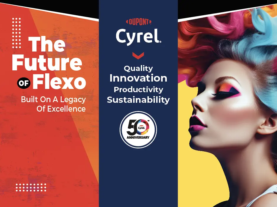
Like this exhibit we created for DuPont™ Cyrel® flexographic plates, the goal of any good tradeshow booth is threefold:
Project a Compelling Branded Presence
Being seen is one thing. Being sought out is something else entirely. Creating a branded tradeshow presence that promises a unique experience incentivizes attendees to interact with you. Make sure your exhibit is findable, memorable, and shareable.
Draw Attention from Every Angle
Bold, well-designed exhibit graphics are always a must, but consideration for distance and environment is a high priority, especially when trying to reach a distracted audience. Design and place your graphics to attract attention from afar and draw people from different locations.
Immerse Attendees in an Experience
Tradeshow visitors check out a booth for just three to five seconds before deciding to walk by or stop in. Incorporate video and interactive technologies, nontraditional lighting, the booth floor, or the overhead space. Showcase your products and services with demos and samples.
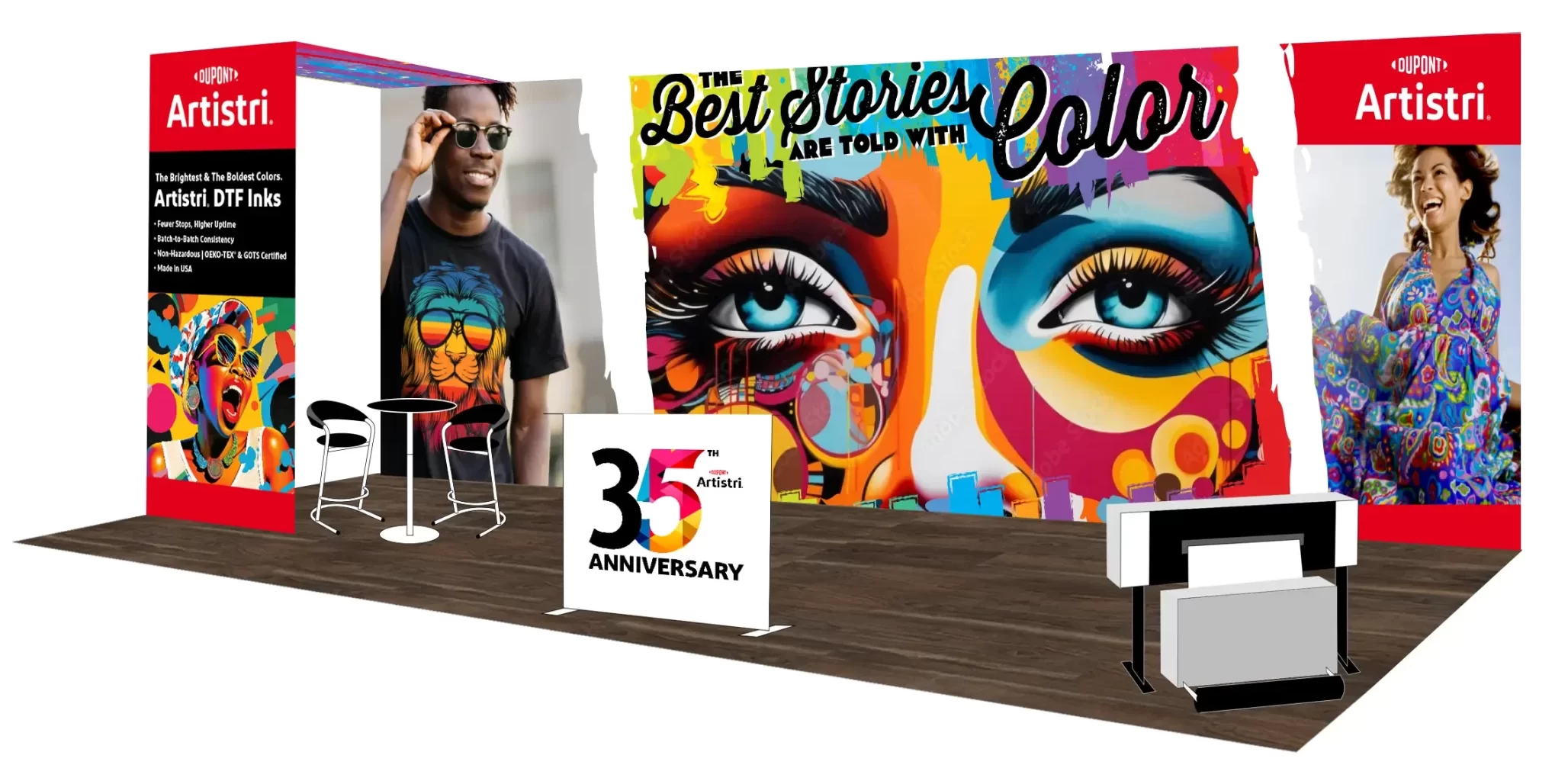
Here’s an example of the alchemy that happens when all three elements come together in one luminous booth design:
Kaleidoscopic Color and Illuminated Panels Make Magic
When the DuPont™ Artistri® team asked us to help them promote their innovative Direct-to-Garment pigment inks at a recent tradeshow, we knew we had to think way outside the 10′ x 20′ box. We devised a backlit panel inspired by the Artistri® brand’s vivid graphics and “The Best Stories Are Told with Color” theme. Emblazoned with a mesmerizing central graphic, the booth served as a beacon for show attendees.
The result was a traffic-stopping, conversation-starting booth that brought in attendees—and even better, they stuck around to observe live printing demonstrations.

Be the Host with the Most: Invest in Signage and Wayfinding
If designing a booth infused with brand DNA is the task of every exhibitor, the task of every event host is to make it easy for attendees to navigate the exhibit hall or conference space.
Easier said than done, right?
“Intuitive” and “personal” are adjectives rarely used to describe expansive conference and exhibit spaces, but no one walks into an enormous hall expecting it to feel like home. What attendees do expect are navigational tools to help them find their way in a new and unfamiliar space.
While it can be tempting to toss up a “welcome” banner and an arrow pointing to the restrooms, effective wayfinding requires significantly more forethought. It not only considers how attendees will flow through a space; it anticipates their needs as they do so. Some well-intentioned event hosts, aware of how overwhelmed attendees may feel, go to the opposite extreme, posting signs overburdened with tiny, unreadable text. In these cases, too much information can be worse than too little—better to keep it on a need-to-know basis.
It’s a fine balance. Your goal is to provide attendees with a friction-free experience, and to help chart a course that will allow them to experience fully all that your event has to offer.
To achieve successful wayfinding design, make sure to:
Plan the Way to a Positive Experience
Prioritizing the purpose, placement, and design of on-site graphics at professional events makes it possible for everyone to get the most out of why they came together in the first place—to share knowledge, make connections, and do business.
Design for Direction, Not Distraction
Be proactive. Envision traffic patterns, potential bottlenecks, and prime locations—registration, meeting rooms, restrooms, dining facilities, lounges, quiet work areas—well in advance. Then map out a strong wayfinding strategy to minimize distraction and deliver value.
Point to the Value of Your Brand
Make creative and intentional signage design choices. Even in an environment of visual distractions, high traffic, and space limitations, signage provides a unique opportunity to bolster perception of your brand via a more empowering, immersive, and successful experience.
Here’s how we followed these directives to guide attendees at a recent healthcare technology conference:
Gaining Momentum with ModMed
Healthcare technology company Modernizing Medicine (ModMed) asked Street Level Studio to brand Momentum, their largest annual conference, as well as design event graphics, collateral, and wayfinding elements. Our integrated campaign for Momentum started with branded event invitations, a registration email campaign, and a website. For the actual event, we created an intuitive program guide, cohesively designed schedules, distinct directional signage, and branded onsite promotional event displays.
Together, these elements established ModMed’s ownership of the conference and enabled attendees to quickly find educational sessions, take advantage of networking opportunities, and feel welcome.

Let’s Meet IRL
If you’re exhibiting or hosting an event, we have some tools that will help you put these environmental design principles into practice. Schedule some time to chat below and we’ll be happy to share them with you.
